News
Introducing our new brand and website!
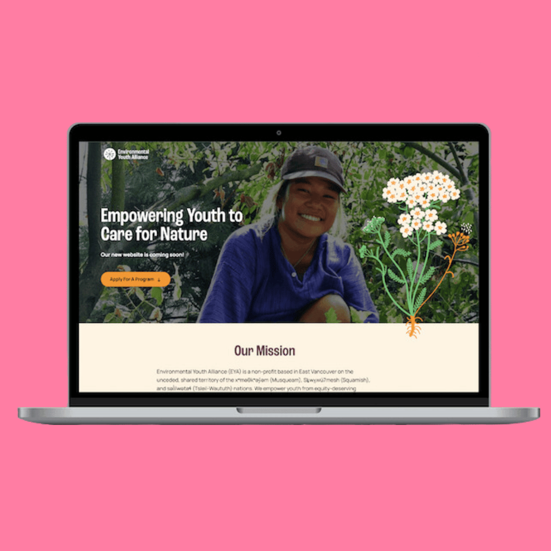
Our colourful new brand reflects EYA’s youthful identity and honours the land we steward.

The colourful new brand reflects EYA’s youthful identity and honours the land we steward and the plants we grow and learn alongside.
Consistent and accessible design will help us connect with equity-deserving youth and better communicate information about our programs and application process, while also expressing the positive outcomes of our work to our supporters.
Our logo is a simple and energetic representation of EYA’s legacy and impact. An eye-catching sunshine circular shape encompasses our dandelion icon which has been a staple part of EYA’s identity for many years. Dandelions are at the core of our brand as they represent resilience, strength, hope and healing. At EYA we work to ‘decolonize weeds’ by inviting youth to understand non-native plants as offering gifts of medicine, food, and fibre, while still recognizing their negative ecological impacts. Although the dandelion is not a native species, we invite the opportunities and gifts this plant brings us physically and metaphorically.

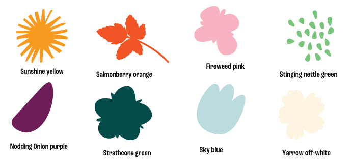
The EYA colour palette is warm, inviting and energetic, and is directly connected to the environment in which we work in Vancouver’s Downtown Eastside and the surrounding areas.

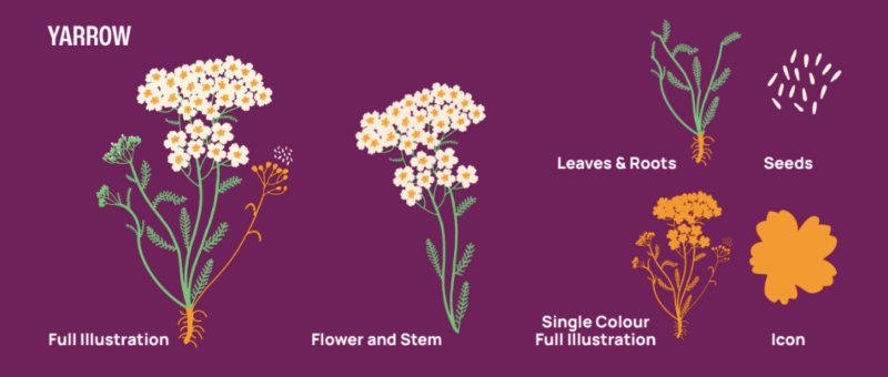
Finally, the plant illustrations contain multiple elements from a plant’s lifecycle and anatomy and consist of seven different species that hold a special place in our community and history, such as yarrow, lupine, and fireweed. All of these are plants our youth have built strong relationships with over the years and continue to provide opportunities for learning and connection with the land.
